The assignment for me was to choose three websites which I visit frequently and then to discuss my likes and dislikes about each.
The three websites I will be reviewing are Twitter, Reverbnation and Gmail. I have spent an ennormus amount of time in both Twitter & Reverbnation. As the social media expert for my band, Smokhaus, I both built a website for the band (which is now down) and started all the social media accounts for our band. Social media accounts from Facebook, Google+, Instagram, Reverbnation & Twitter! Gmail is my mail client and as such, I spend a lot of time each day processing the 300+ emails I get from three different email accounts.
I'll be answering the same questions about each of these websites:
I love the clean look of and fast load times of Twitter. One nice thing that is not immediately noticeable, is the fact the site scales to many different form factors and naturally! Both when either re-sizing a browser window or with the use of a handheld device, the site seems to flow naturally.
Since the design is so clean, it is hard to find things to dislike.
The color scheme is White with an accent of blue with black typeface. Blue are for hyper-linked content. All other colors seem to come from the content posted.
The color scheme does seem to match the sites's purpose, which is to get out of the way of the user content.
The primary users of the site are Twitter account holders, which now number around 317 million. Since the last election cycle, Twitter has taken on even more importance as a mouthpiece for President Trump. SNL has taken to impressions that do not meet with Trump's approval.
The website design of clean and simple does seem to cater to the user base. The user base are the ones determining how the site looks through their tweets and media attachments. Recently both videos and giphy's have been introduced into the Twitter universe.
There are many goals that users have in visiting Twitter. These incude sharing their thoughts and feelings.
Twitter gets out of the way of its users to allow them to use the site showcase the information they want to share.
When anserwing the question "Does the site succeed in providing a good user experience?", I would suggest that Twitter does an outstanding job by not cluttering the interface. This then allows the user to define their experience for themselves.
This goal is NOT easy to accomplish, but Twitter and its 317 million users are accomplishing this task every second.
I do feel the site succeeds in providing a good user experience (UX). The issues Twitter has do not stem from the the UX experience.
Reverbnation has each landing page built by a Web driven Band website builder. For this reason, it impossible to judge. However, since templates are used the site as a whole is strengthened as common elements are placed similarly in each artist or band's profile.
It is easy to dislike the fact that every Band or Artist page is contructed similarly. However, for a person cruising to find new band the similarity as an actual strength.
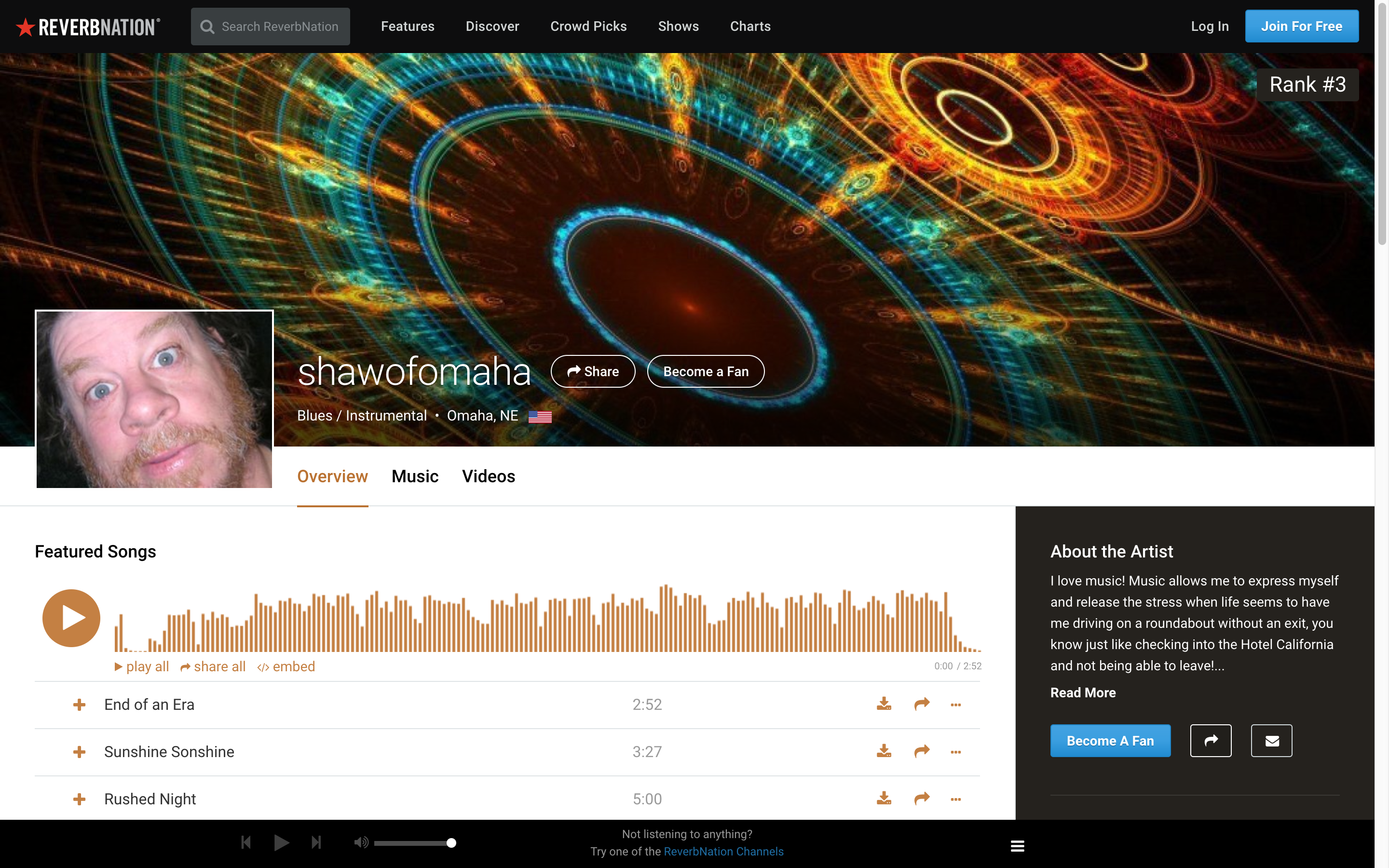
The color scheme is White with an accents of Black, blue and red. The Black is used in the Navigaton Header and footer, with the Link words highlighting to a white text on hover. Other minor accent colors that are used are a light brown and a darker blue.
The color scheme does seem to match the sites's main purpose, which is to get out of the way of user content. Red was used as an accent color to draw attention to Reverbnation clickable Logo in the upper left of the page, while blue was used for clickable links. Brown was an accent color used on the Featured Songs division.
The primary users of the site are band members (promoting their music to other bands, artists) and the public at large who may looking to find new music. Promoters, internet radio stations and other content providers also frequent the site.
The website design, of clean and simple does seem to cater to the user base. It seems that the website building MAY be the best thing the website has going for it, and it got me interested in coding web sites!
There are many goals that visiting users have when they surf to Reverbnation. Bands and artists connect with each other for cross promotion. Promoters and internet radio stations try to connect with bands and artists to attract them to their venues. Fans, meanwhile, may be interested in finding the next Great, band or artist while visiting Reverbnation!
Revebnation gets out of the way of its users to allow them to use the site to showcase the information they each want to share.
When answering the question "Does the site succeed in providing a good user experience?", I would suggest that Reverbnation fails its bands and artists in connecting with their fans. However, the use by the website of powerful web site building tools can free the artists to persue their own creative endeavors.
The goals of artists on Reverbnation, if they include building fan base are difficult to achieve with the current implementation of the site. This site has undergone 2 facelifts in the last 36 months, since 2013.
I do feel the site succeeds in providing a good user experience (UX). The issues that Reverbnation has, do not stem from the the (UX) experience, but rather from the ineffectiveness in reaching an artist's fan base.
Gmail inherits its color scheme of black text on white background with the use of primary colors as accents. This the same color theme as Gmail's parent company Alphabet. This is an attempt to be all things to all people, while also trying to be more universally appealing.
Since the design is so clean, it is hard to find things to dislike.
The color scheme is Black Text on White background with accents in the rainbow of Google's colors. Google's colors are used together in the logo and then separately as accent colors, like in new mail notifications on each of the tabs.
The color scheme does seem to match the site's purpose, which is to get out of the way of users accomlishing their communication tasks of email, phone, video talk and messaging, if they're using all of Google services.
The only users of the site are Gmail account holders which now number around 1 Billion. Other interesting facts include: The average age of a Gmail user is 31 and 75% of Gmail users open their mail on a mobile device.
The website design, of clean and simple does seem to cater to the user base. However the base is a somewhat captive audience (users MAY elect to use other apps).
There main goals of users of Gmail is the communication tasks of email, phone, video talk and messaging. Each task initally varied in the ease in which it enables the user experience, but now all three are equally intuitive.
When answering the question "Does the site succeed in providing a good user experience?", I would suggest that Gmail does an outstanding job by not cluttering the interface. This then allows the user to define their experience for themselves.
This goal is NOT easy to accomplish, but Gmail and its over one billion users are accomplishing this task every second.
I do feel the Gmail site succeeds in providing a most excellent user experience (UX).